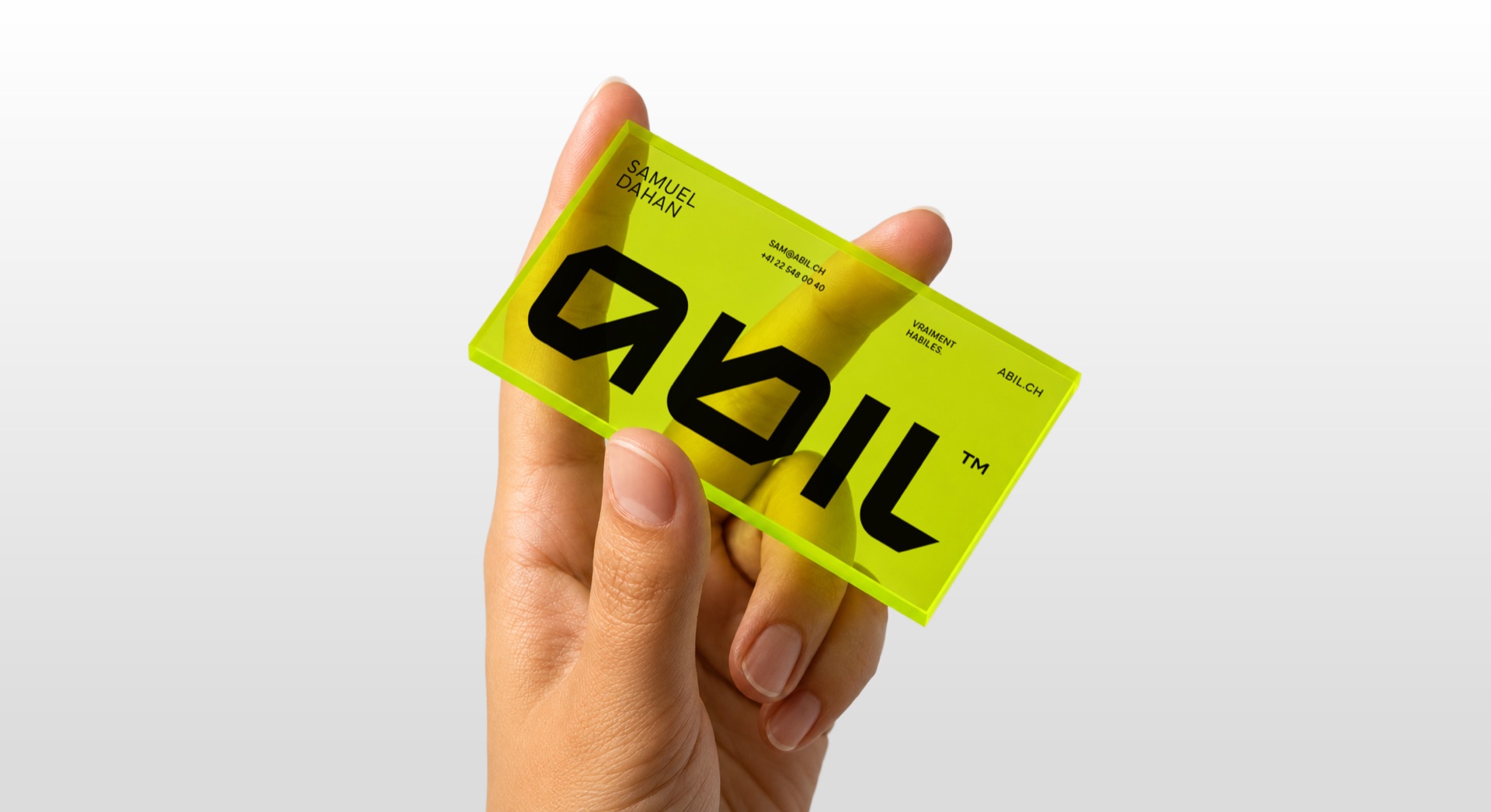
Vraiment habiles: why we changed our skin
The story of our own rebranding: the A kept, the yellow awakened, and a name that finally says what it means.
 Samuel Dahan
Managing partner
The cobbler's children go barefoot. We spend our days clarifying brands, and ours said everything and its opposite. So we did for ourselves what we do for clients: an honest diagnosis, then choices.
The name first
Abil comes from habile, skilful: able to communicate. For years that meaning stayed locked in an explanation. The new signature frees it in two words: vraiment habiles, truly skilful. Not a promise, our name.
What we kept
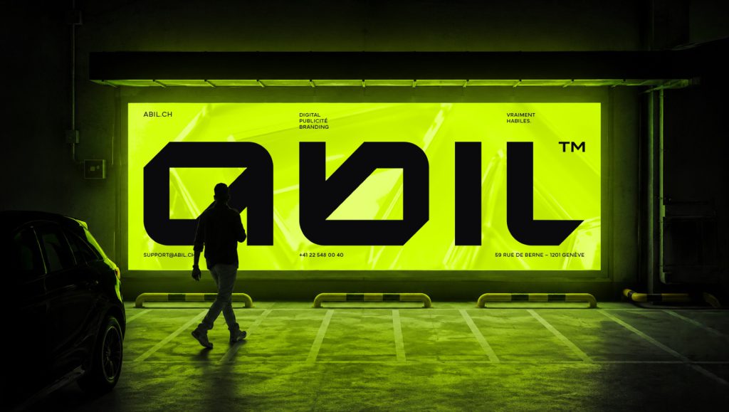
The A. It was there from the start, our clients know it, it carries our history. We redrew its geometry, one hard angle, one organic curve, and it became the gene of the whole identity: the same gesture repeats in the logotype, the icons, down to the corners of our interfaces. Geometry brings control, the curve brings the hand.
What we awakened
The yellow. It already existed, shy. We pushed it to electric citron, a colour impossible to ignore in a feed, set on near-absolute black. Two colours, not one more. Brands that doubt multiply colours; confident brands choose two and hold on.
The voice, not just the image
An identity is not only seen, it is heard. Half the contacts between a brand and its clients happen through words: an email, a quote, a page, a message left on a Tuesday evening. A company that changes its visual skin but keeps an administrative voice has done half the journey, and the visible half is not the more important one.
So we wrote our voice the way one writes a visual guideline, with checkable rules. The answer first, the context after. No jargon without its translation in the same sentence. No promise that cannot be proven with an example. Short sentences, because our clients read between two meetings, not in an armchair.
There is also a list of forbidden words. Innovative solutions, synergies, 360-degree support: all the vocabulary that fills brochures and says nothing has been banned. The replacement rule is simple: write what you would say to the client in a meeting, with the words you would actually use.
Typography carries that voice. We chose a typeface that is geometric but warm, whose shapes answer the gene of the A, and two weights only. One to speak, one to insist. When everything is bold, nothing is important; that is true in a headline as in a strategy.
The final test is brutal and costs nothing: reading aloud. An email, a page of the site, a line of a quote. If the sentence can be said to a client's face without blushing, it stays. If it fails the out-loud test, it gets rewritten. That filter removes more bad text than any proofreading.
Since then, one detail keeps coming back: clients tell us our emails sound like our site, and our site sounds like our meetings. That is exactly the point. Consistency is not an aesthetic luxury, it is what makes the third contact feel like you already know the house.
And it is measurable both ways: when a text is off, it shows immediately, because everything else holds the same note. A defined voice makes the false notes audible. It is the best quality control a brand can afford, and it fits on one page.
A rebranding, step by step
Step one, the diagnosis. Everything goes on the table: every logo, every document, every page, every post. We note what each one says about the brand, and compare it with what the company has become. The gap between the two is the real brief. Ours was painful: we were selling clarity with a confused identity.
Step two, the sorting. Everything faces three questions: is it true, is it recognised, is it useful tomorrow? What ticks all three stays. What ticks none leaves. What sits in between gets discussed, and that is where the real decisions happen. The A ticked all three boxes. The rest of the old system, almost nothing.
Step three, the system. A rebranding is not a logo, it is a grammar: colours with a role, a typeface with a voice, spacing rules, one gesture repeated everywhere. We built ours around a single gene, the angle and the curve of the A, so that every piece is recognisable even without the logo.
Step four, the reality test. Before switching everything over, the system is tested on the most thankless pieces: an invoice, an email signature, a compressed story, a business card seen from afar. An identity that only looks good large on a studio screen is not an identity, it is a poster.
Step five, deployment by order of impact. First what clients see every week, the site, the social channels, the emails. Then the documents, the templates, the stationery. Every migrated piece is a piece nobody touches again. Six weeks between the decision and the complete new skin, without a single day of interruption.
The traps we avoided
The clean slate. Throwing everything away is seductive, it makes beautiful presentations. But a brand that has existed for years holds capital: clients who recognise it, a history, habits. Destroying that capital for the pleasure of the new means paying twice, once to lose it, once to rebuild it.
The trend of the year. Every year has its style, its gradients, its typeface of the moment. Sticking to it dates your brand with precision: everyone will always know in which year you redid your identity. We looked for the opposite, choices simple enough to age slowly.
The cosmetic rebranding. Changing skin without changing anything else is the most expensive trap. If the offer is confused, a beautiful logo makes it confused and expensive. Work on the form only makes sense if the substance follows: our signature changed because our way of working had already changed.
An SME that changed skin without losing its clients
One anonymised case to finish. A fiduciary firm in French-speaking Switzerland, twenty people, an identity drawn when they were two. The problem was not beauty, it was the message: everything breathed small outfit, while its mandates had become complex. It was losing tenders on an impression.
Same method: diagnosis, sorting, system. The name stayed, the historic colour too, darkened one shade to hold its own next to the big firms. What changed everything was elsewhere: serious typography, impeccable documents, and case studies written as evidence rather than as brochures.
Result: not one existing client was lost along the way, and the tenders started being won. The rebranding did not make the firm better, it stopped making it look smaller than it was. That is often what a good rebranding is: taking off the suit that no longer fits.
This work is exactly what we do for clients: understand what is true, keep it, discard the rest, and give the whole a shape that belongs only to you. If we lacked the courage to do it for ourselves, why would you trust us with yours?
Three questions before you start
First question: what is actually stuck? If clients confuse your services, that is a structure problem. If they believe you are smaller than you are, that is an image problem. If they cannot find you, that is a visibility problem. Those three problems have three very different prices, and the logo only answers the second.
Second question: what must survive? List what your clients recognise: a name, a colour, a symbol, a tone. That list is your capital. A good provider starts by asking what must be protected; a hurried provider starts by showing you moodboards.
Third question: are you ready for it to show everywhere? An identity only lives if it is applied with constancy, on the invoice as on the shopfront. If the company has no time to migrate its pieces, better to postpone the work than to have two brands in circulation. The half rebranding is the only one that fails every time.
If the three answers are clear, the work is worth it, and it always starts the same way: everything on the table, every piece printed, an honest look. A brand is nothing but a promise repeated without fail, piece after piece, year after year. Our moult took six weeks; yours may take less, maybe more. What matters is that in the end, every point of contact says the same thing about you. That is what our signature commits us to every morning, and exactly what we build for those who entrust us with their skin.