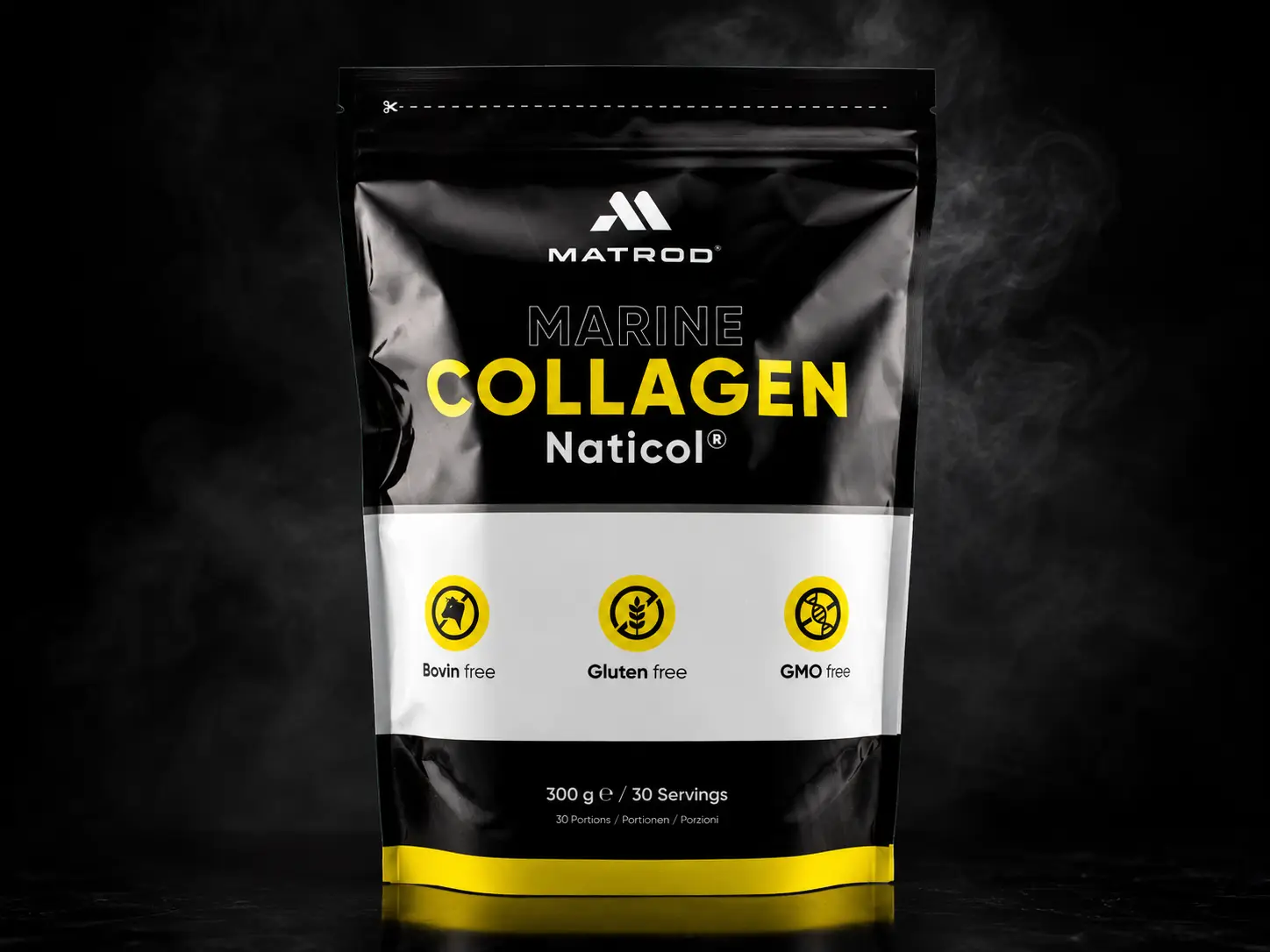
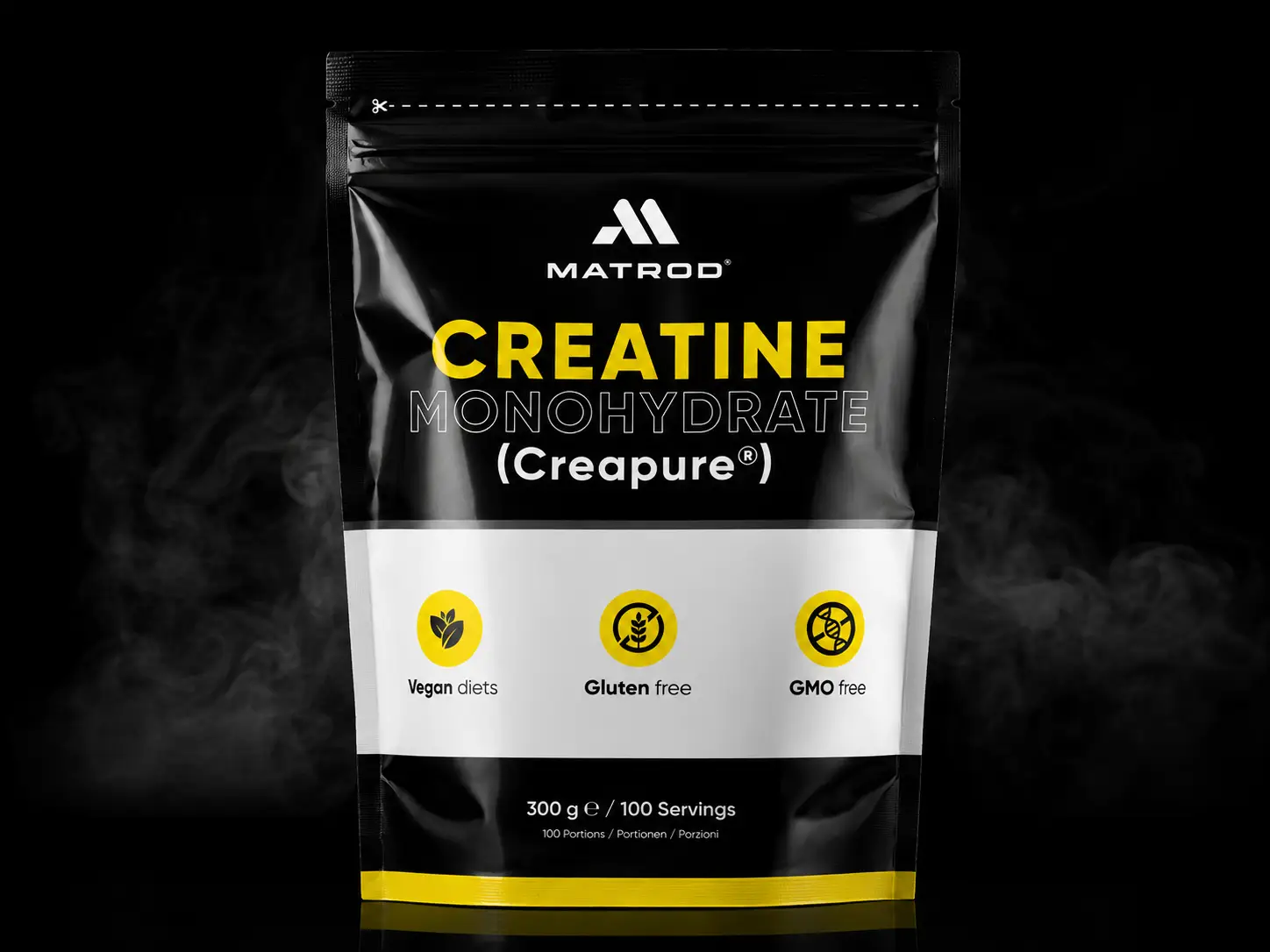
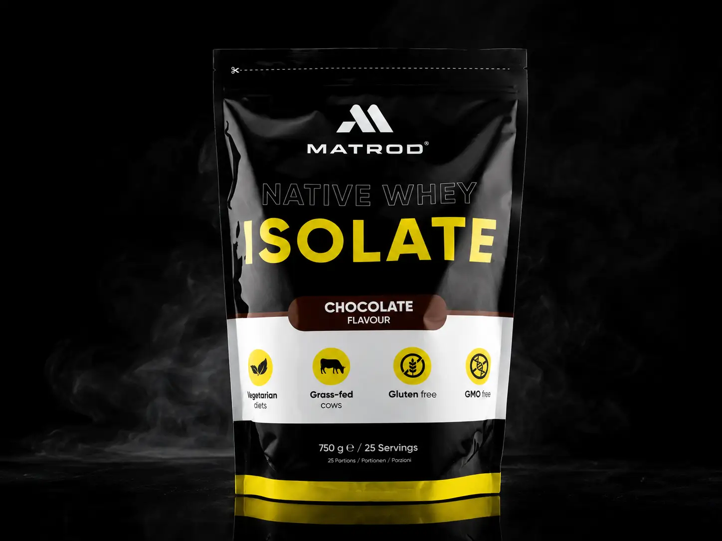
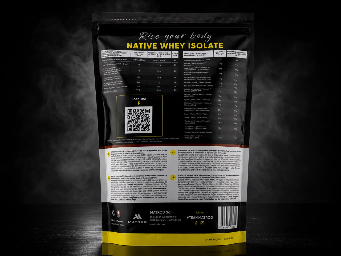
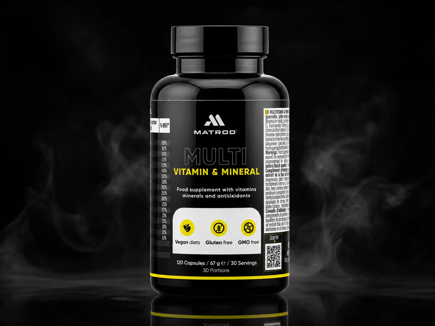
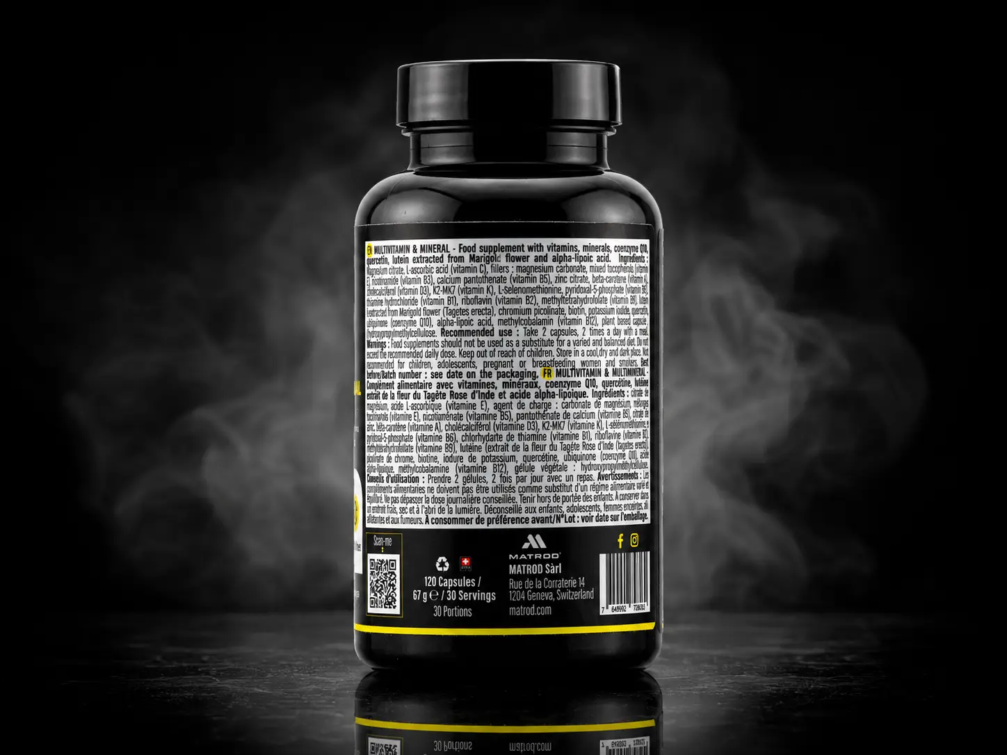
A brand to create and a shop to open: visual identity, content, e-commerce platform and acquisition, carried end to end by the same team.
Matrod sells sports nutrition online. At the start there was no identity, no copy and no shop: a commercial intention and a market already taken. The work therefore began with what did not yet exist, before there was any talk of pages and baskets.
We took all four strands from end to end: the visual identity, every piece of brand copy, the shop and the acquisition channels. One team from the first mark to the first purchase, with no handover between suppliers.
An e-commerce launch rarely fails on one point. It fails because the identity, the copy, the shop and the acquisition were made separately, and none of the four keeps the promises of the other three. Here they were thought through together.
What the project covered
4 strands
identity, content, shop and acquisition, treated as a single piece of work.
1 team
from the first mark to the first purchase, with no handover.
Day 1
the acquisition channels were ready at opening, not added afterwards.
What we took on
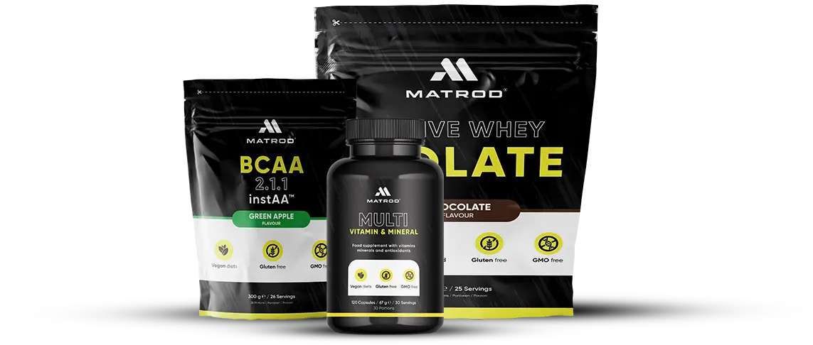
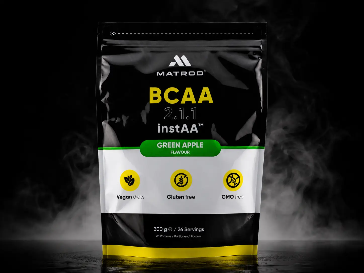
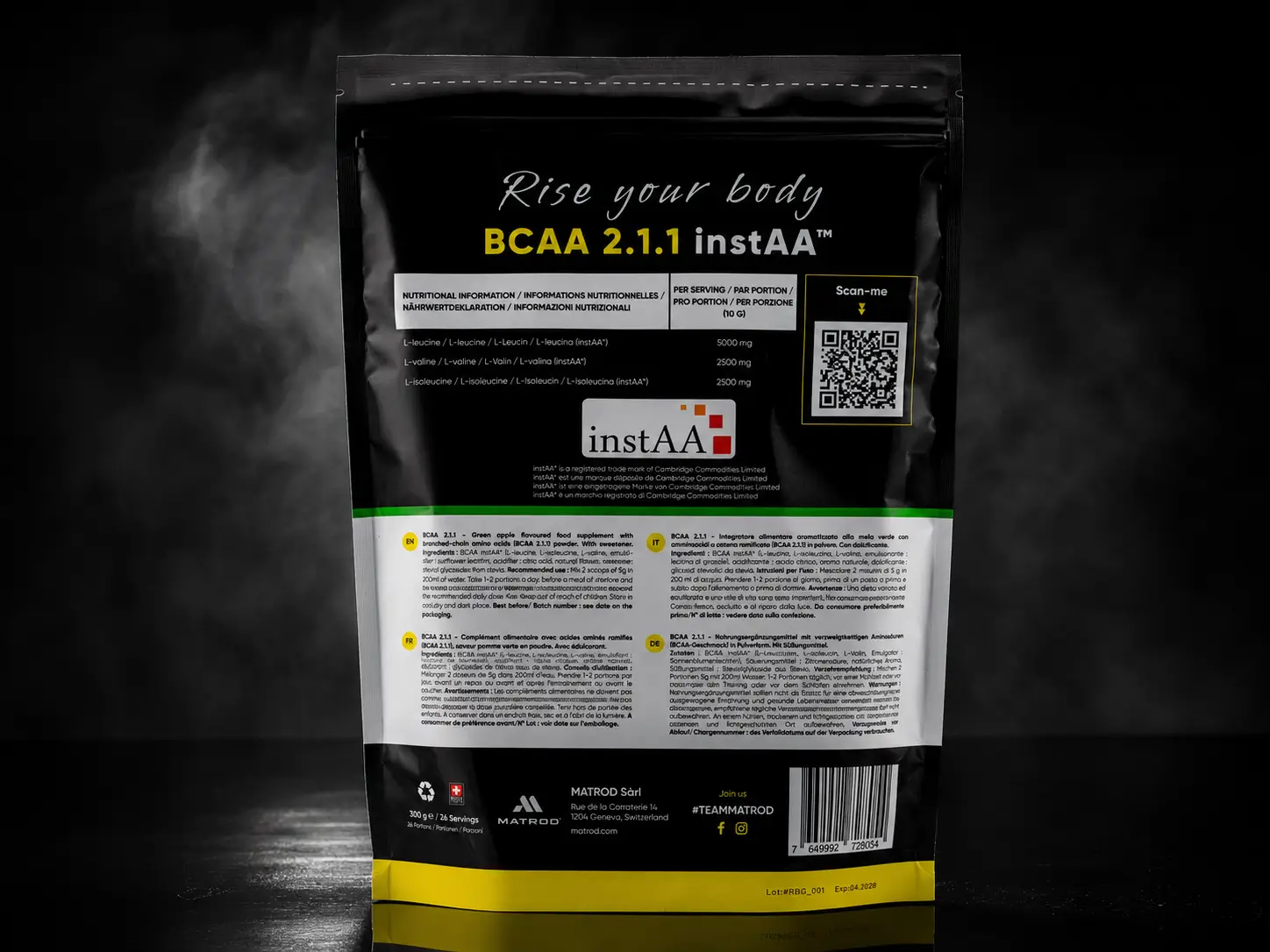
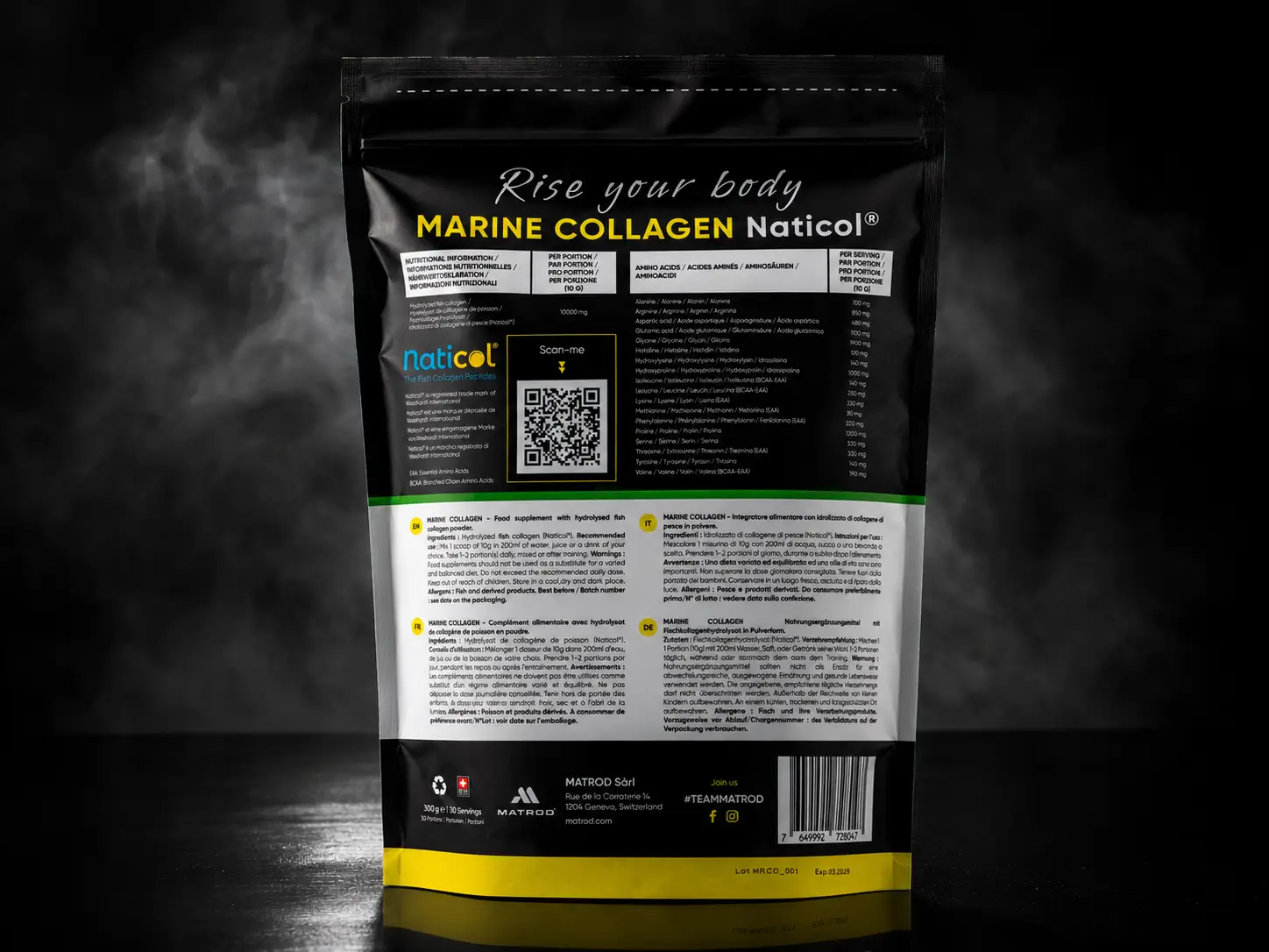
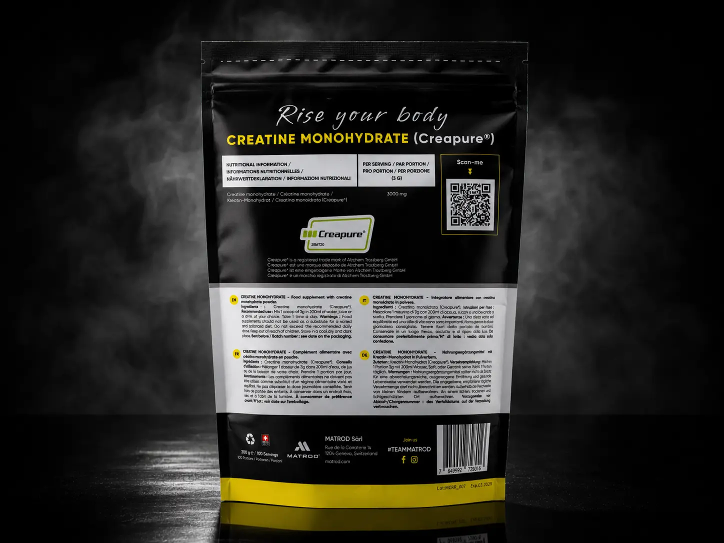
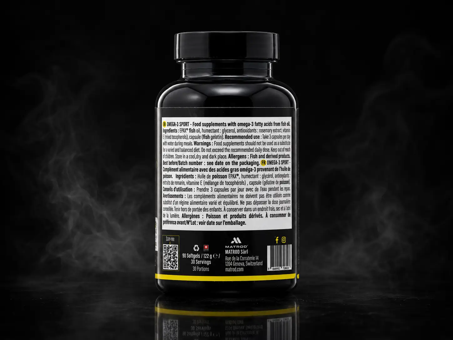
Visual identityThe complete identity and art direction: logo, colours, typography, packaging.
Brand copyEvery text on the site, from the product pages to the background ones.
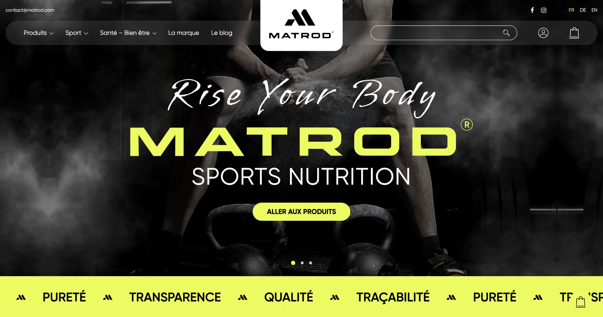
A shop made to measureA purchase path drawn for legibility, speed and the phone.
AcquisitionPaid and organic channels set up before opening, not after.
The shop
Most of the buying happens on a phone, often standing, often in a hurry. The shop was drawn for that: few steps, few fields, nothing waiting on a load.
A short path, where each screen asks for one decision only
Product pages legible without zooming, carrying what people actually look for: dose, taste, price per serving
Speed held as a constraint from the start, not checked at the end
A basket and a checkout drawn for the thumb, not for the mouse
A base that grows: new ranges and new markets without rebuilding everything
A brand that is launching does not need to say everything. It needs to be recognised at the second glance.
ABiL MEDiAS
What it showed
Doing the identity, the content, the shop and the acquisition under one roof wins back what is usually lost between suppliers: the tone stays the same from the packaging to the product page, and the campaign speaks the language of the site it sends people to. For a brand that is launching, that is the difference between a shop that opens and a shop that sells.
Frequently asked questions
With what is missing: the identity and the words, before there is any talk of pages and baskets. At the start Matrod had a commercial intention and an already crowded market — no visual identity, no content, no shop. The order matters: a shop built before the brand gets rebuilt a year later.
Because a launch rarely fails on a single point: it fails when the identity, the words, the shop and the acquisition were made separately and none of the four keeps the promises of the other three. Under one roof the tone stays the same from the packaging to the product page, and the campaign speaks the language of the site it sends people to.
It is built for the thumb. Most buying happens on a phone, often standing up, often in a hurry: a short journey, one decision per screen, product pages readable without zooming and carrying what people actually look for — dose, flavour, price per serving — and a checkout drawn for the thumb, not for the mouse.
Not by saying more than everyone else. Sports nutrition is a crowded shelf where everyone announces the same thing. A brand that is launching does not need to say everything: it needs to be recognised at the second glance. That is what the visual identity decides — one colour, one typeface and one tone held everywhere, from the packaging to the product page.
Yes, that was a starting condition rather than an option: new ranges and new markets are added without rebuilding everything. Speed too was held as a starting condition, not checked at the end.
Most of the time, yes. This case starts from zero, but the majority of projects begin with what is already there: the brand, the site and the numbers in place — and we take on the piece that is stuck rather than the whole. The question is not whether to redo everything, it is where to start.